Pantone Color Of The Year Influences Product Development and Purchasing Choices
An inside look at the process behind the 2015 selection and its impact
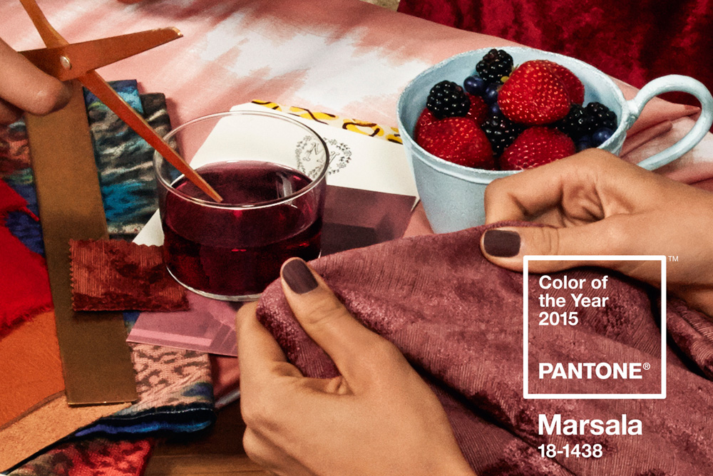
For the past 15 years, color authority Pantone has celebrated a Color of the Year. This year the naturally robust and earthy red Marsala (aka PANTONE® 18-1438) got the nod.
Working with New York-based experience design firm Sub Rosa, Pantone put together a creative campaign behind their color choice to demonstrate the potential of the color. Marsala was chosen for its universal appeal and versatility, including the ability to translate to fashion, beauty, industrial design, home furnishings and interiors.
This marks the second year of Pantone and Sub Rosa’s collaboration on a color of the year campaign.
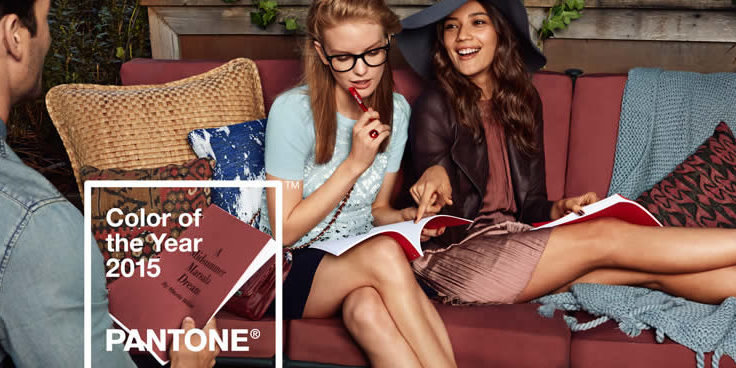
Pantone asked Sub Rosa to start by creating a series of images that captured the color’s bold and exciting spirit. The two teams then worked closely together on a print and social campaign, with careful attention paid to making sure the tone and energy of the creative delivered the mood of an imagined place.
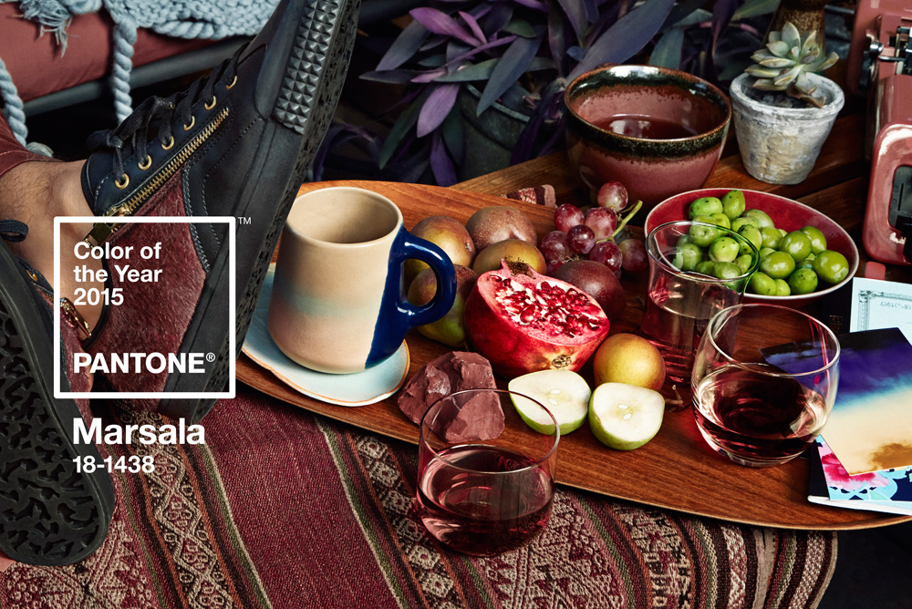
Sub Rosa decided to accomplish this by organizing a story through food, drink, cooking and friends coming together at various stages of an evening meal: appetizers, dinner and dessert. In each vignette, it created multiple layers that speak to a broad design audience.
As the party moves from appetizers on the deck to dessert by the fireplace, Sub Rosa plays into associations and feelings that Marsala evokes by adjusting the character and contents of each room.
Perhaps even more interesting though is how Pantone’s Color of the Year influences product development and purchasing decisions in so many industries, from fashion to the home, as well as packaging and graphic design.
Laurie Pressman, VP of the Pantone Color Institute explains how the color is chosen each year:
The Color of the Year selection requires careful consideration. To distill the prevailing mood into a single hue, the team at the Pantone Color Institute quite literally comb the world looking for future design and color influences, watching out for that one color seen as ascending and building in importance through all creative sectors. Influences can include the entertainment industry, upcoming films, art, emerging artists, travel destinations and socio-economic conditions. Influences may also stem from technology, lifestyles + playstyles, new textures and effects that impact color, and even upcoming sports events that capture worldwide attention.
Creative exercises are also part of the process.
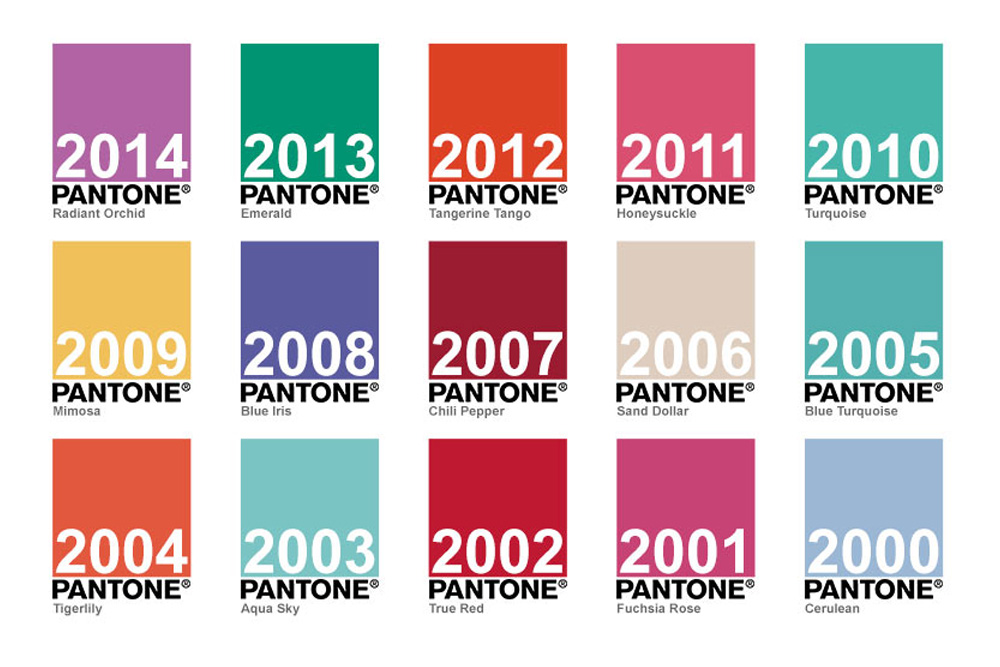
Before finalizing its choice, Pantone takes a look back at all previous selections by laying them out visually, considering how they appear together and revisiting the color messaging of each shade. It keeps careful record of what events or trends were present when it made each color selection and what the current climate is calling for. “The Pantone Color of the Year is our way of expressing through color what is taking place in our global culture at a particular moment in time,” Pressman adds. “There really are reasons why a color family or individual color comes into prominence when it does. For the most the popularity of a color reflects the age that we are living in.”
So you might wonder, how does that translate to the products we see in the market.
Does the selection of Marsala mean we’ll automatically see this shade used in more products?
The short answer is yes. Pantone’s selection have historically been influential and each year that impact grows. Typically, the color of the year does increase in the year of the announcement and continues a measurable impact up to three years out. The prevalence of social media worldwide creates a viral effect and repeated exposure can dictate consumer behavior. Pressman speaks to the psychology behind color for both consumers and retailers:
Color plays a critical role in consumer purchasing decisions. It’s the first thing the consumer sees – the thing that will determine whether or not they go one step further to try something on or pick up the product to take a better look. With today’s consumers much more educated about color and color trends, they want to make sure they are on trend. Product developers and retailers want to make sure they have the right colors in their assortment to satisfy consumer demand.
While the average consumer may not be thinking of a single shade at the level of detail color experts and designers do, there’s a lot of subtle hints and cues that our brains are processing when it comes to how we perceive color and the way it makes us feel. I for one will have to watch and see whether Marsala makes an appearance in my wardrobe.
Author: Kiran Umapathy


